Colour questions
- Sarah Fielke

- Jun 26, 2024
- 6 min read
Hi StitchyMites
I hope you’re all well. After a quiet week I am finally on my way home to my studio on Friday! It has been nice seeing family but I will be glad to be back home. I’m not sure that Chippie will though - three weeks of other dogs and rolling in echidna poo and chasing through paddocks has been her bliss. Needless to say she is exhausted.

A few bits of news this week before we go forward. For the first time ever, Aurifil are releasing an Advent Calendar! From the Aurifil peeps:
A delightful homage to the holiday traditions of our childhood, it was designed to rekindle the pure, unadulterated joy that once sparkled in our eyes as we eagerly awaited the festive season. Each compartment holds one small spool of Aurifil’s 100% cotton thread, meticulously curated to bring a burst of excitement.
Le Alpi Advent Calendar will have a palette of 24 hues includes five brand-new, limited-edition 50wt colors exclusive to this advent calendar as well as the introduction of five new shades of 8wt and a medley of Aurifil’s cotton thread weights.
This is a pre order that will arrive around November 2024, and needs to be ordered from my website in the next few days, because once they’re gone, they’re gone - and I can’t order more. Don’t miss out, its going to be lovely. Order here

Also, despite me thinking that the book for the Stop, Thief! BOM wouldn’t be out until 2025, apparently I am editing it in July and it will be in your hot little hands sometime in August. You can preorder at my website - and don’t forget that if you were a BOM member for Stop, Thief!, you have been sent a discount code.

And also! I have a bunch of classes coming up in the next 6 months or so. My own retreat classes are in August in Sydney, you can find the bookings here. I have so much fun stuff planned, including goodie bags and prizes, along with the classes themselves. You can find all the info here

I will be in The Netherlands and Germany in October - at Atelier Quiltlokaal and Bossche Quilts & Meer in The Netherlands, and Quiltzauberei in Germany. You can book by contacting the shops directly.
I am teaching at Road to California in January 2025, and class registration opens on July 1, all the information will be at their website https://www.roadtocalifornia.com/

I will be teaching my brand new Tweedle Dee Project Bag at all these locations, as well as other things!

I hope you’ll come along and stitch with me somewhere close to where you are :)
On to colour!
From last week’s homework, here are some value explorations from Sara and Jeanne, they show before and after of their arrangements with the naked eye, then after looking for the value through an artificial one. Its always interesting to see how much has changed. Of course, depending on what you chose to start with it can be very easy or very hard, and theres always a few than jump no matter where you put them. In Jeanne’s selections you can see that the purple fabric jumped places, but its the red one that catches my eye. To me it seems lighter than the pink tin both pics, but in pic #1 it’s less so. That’s because moving the purple has changed the value a little. Squint your eyes at the pics and see if you agree.


Sara’s fabrics are interesting too - they have shifted around quite a lot after her black and white photo. The one that interests me here though is the blue with the white sunflowers on it. Sara has placed it with the darks each time, but that fabric isn’t actually about the colour of the background, it’s about all the white in it. I would try putting it right up the front with the lights and taking another pic in black and white Sara, and see what you think! :)


This week I’m answering the questions I’ve been sent as we go through playing with colour. There have only been two so you’ve made it nice and easy for me .
How do you photograph fabric to get the true colour?
Sometimes, this is reeeeally hard. There are some fabrics that just won’t come out the right way, no matter what you do! Here are some things to try though -
- Make sure you’re in natural light. Your colours will be more accurate and the fabric will look more real and true. The colours in a light bulb can change colours and reflect off fibres, especially when theres a warm bulb in or a really bright white one.
- The colours in the paint on walls and surfaces you’re using for photography can also mess things up, so if you really want the colours are true as you can get them, use a white or very neutral background. You can always adjust this afterwards in a photo app or on your phone, but changing the warmth (yellow) or cool (blue) on the picture.
- Use a piece of white cardboard or paper to reflect the light back onto the surface. Uneven light can make the fabric look strange or faded. Make sure that the light yours using isn’t making shadows or lines on your fabric.
- We all have smart phones and access to apps and computer programs - use them! Sometimes its raining outside or you don’t have access to great light, so use the tools on your devices to help you get the colours right. Most often, brightening or darkening the photo and adjusting the warm/cool settings is all thats required. Adjusting the setting manually in this way is better than using a filter because you have control.
- Take a lot of shots and work with editing a few of them rather than relying on just one. Sometimes the light in one photo will work better than another even though you don’t expect it to.
2. Do you work with fabrics from collections, when the colours are very collection specific?
I don’t. I don’t ever, ever consider fabrics to be collection specific. If I do buy a collection, I immediately break it up and put the colours in the sections of my stash where they belong. Some designers have a palette they always work within, and the colours are SO very them! Think for example Heather Ross (orange, kelly green, pink, aqua), or Tula Pink (aqua, pink, apple green, purple). If you Google “Heather Ross fabric” (or whichever designer you like) a little rolling gallery of their fabrics will come up at the top of the page, and you can scroll across and see what I mean. This is by no means a bad thing - the two I named are two of my favourite designers! Their colours are very specific and help to define their brand and their style.
There is absolutely no rule whatsoever that says you have to use their fabrics together. For me, their unusual and specific colours are what makes them so interesting to my stash. When I’m looking for “aqua”, aqua can be Heather Ross or Tula Pink or Anna Maria Horner or an aqua and white stripe or all four of those together! Fabric as a tool is about COLOUR, not print. Even the “uglies” in your stash are so so useful if you stop being worried about what’s printed on them, and instead begin to use them like paint.


I hope those answers help! What do you think? More questions? Let me know in the comments!
For your homework, I want you to look for a picture you would like to base a quilt on. This is NOT going to be a pictorial quilt!! We are going to base some blocks (or a whole quilt if you get excited) off a photograph and the colours in it. For example, something like these -


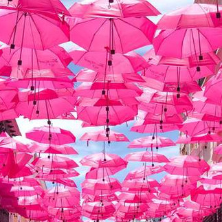
You can choose one photo or four or 15, its up to you. They can be one colour, or many. Just choose something with colour palette you like - the subject of the photo is irrelevant. See you next week!
Sarah x
Comments