Colour your world
- Sarah Fielke

- Jul 5, 2024
- 4 min read
Hi Smites
I hope your day is great! I am knee deep in unpacking from our trip, repacking to leave for Sisters on Saturday and packing Big Woods orders. Everything here is about taking things out of suitcases and boxes and then putting them back into other ones.
Our colour exercise this week is the start of next weeks larger one. We are going to start sewing a block, or a few blocks, or even a whole quilt if you get excited. There will be instructions for the blocks etc next week, and some colour layout ideas the week after, and then we are done with out colour explorations for time being. I hope you’ve all enjoyed them…. anyone got anything burning away in their minds that you’d like from StitchyMites next, or down the line? Door is always open for you peeps!
Last week I asked you to find some photos that you think would make a good quilt palette. n answer to a question I got about doing this exercise, there are no copyright issues with using a photo in this way because we aren’t going to actually make a quilt depicting the photograph. All we are doing is using the photo as a colour reference to spark an idea. If you do ever want to make a pictorial quilt using an image that you didn’t take or draw yourself, yes you will need to get permission from the original owner of the quilt.
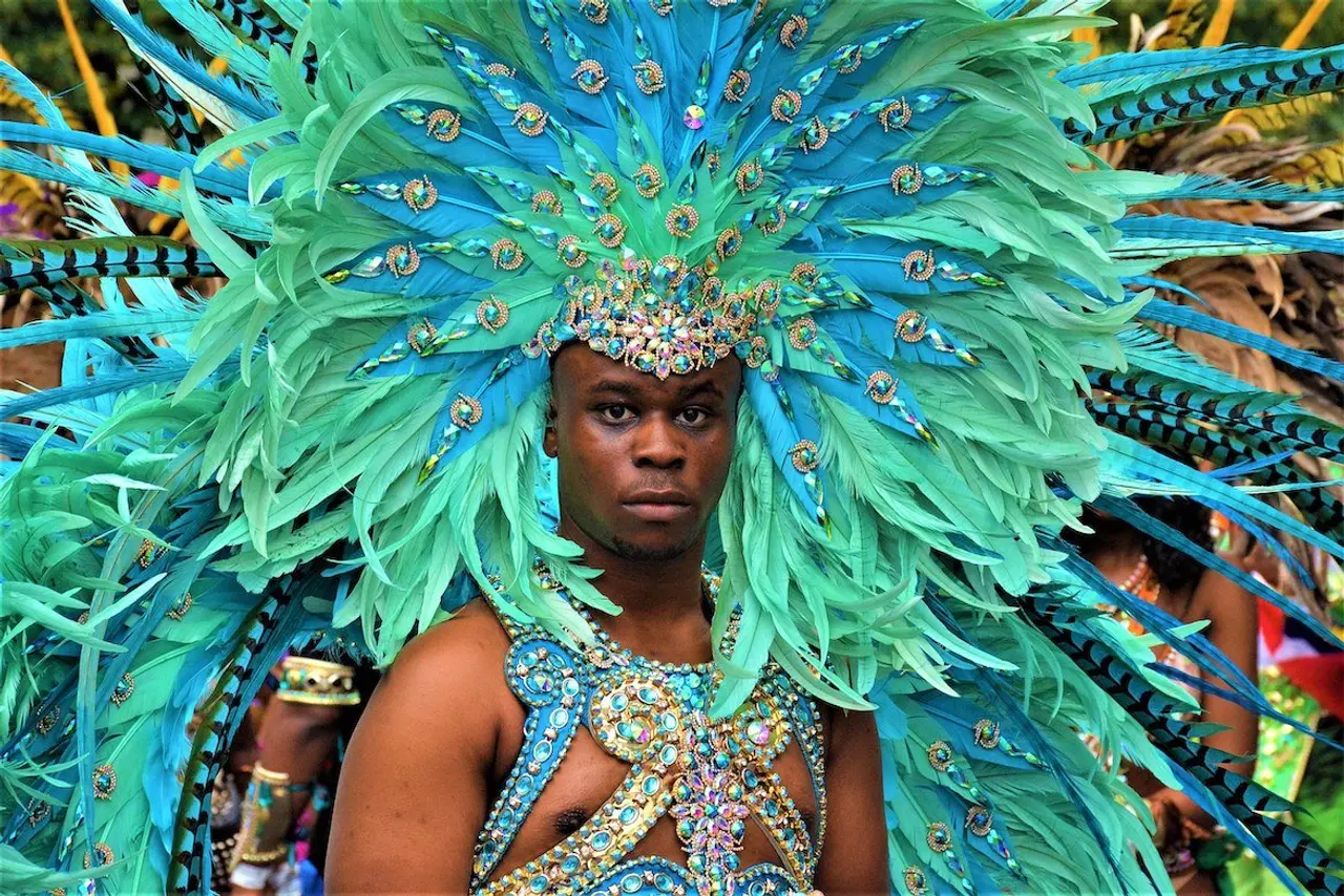
Here are some of the pics I got from you, and one or two I chose myself -


What I would like you to do this week is to take a photo (or two or three or four…) and pull the colour palette out. Something like this:

And then load it into Canva’s palette generator, or something similar! The Canva one is here https://www.canva.com/colors/color-palette-generator/ and you won’t need to sign in or pay for anything, but there are lots of others. Just drag the photo into the box, and it will generate a colour palette below it for you. It’s very simple to use, but it doesn’t do much else. If you’re looking something a bit more complex, that you can change or tone your colours down and find other things that go with them, you an try the Coolors website which I think is completely brilliant.
Theres a little tutorial about how to use it when you first go there, so make sure and read it and then it’s really easy to find your way around. Its pretty fun and a bit addictive so make sure you have some time to play with it!
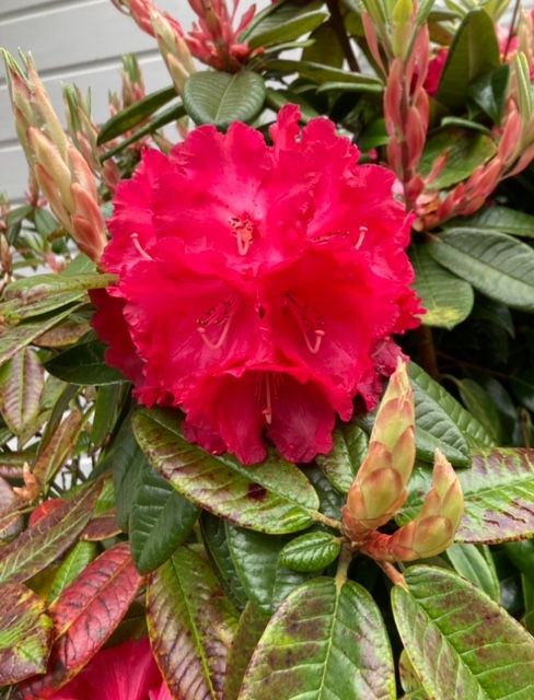
The palettes they generate won’t pull every single colour from the photo, usually just the four or five dominant ones. It’s a starting place rather than a concrete surface. For this photo of the flower for example, Coolors didn’t pull the red out. You know the red is there - but the different dark shades are a good place to begin your palette, and then you can add the red in.

If you don’t want to use a website, you can get out your coloured pencils, or some paints instead - or as well as. Even if you do use the websites, try taking the colours from the photo and using your art supplies to colour your block in, by shading like we did with the colour wheel. It might take little more time, but puling the colours out of a photo like this using your eye instead of a computer tool helps you to gain an understanding of how the shades bend together, and its also a nice mindful activity that doesn’t involve a screen!
Once you’ve got your first palette generated, its time to start having a play. There is a block drawing in a seperate file for you to download below - all the measurements for the block will come next week. You can colour your block any way you choose, using the photo you chose.
Here are my block explorations using the photo of the purple mountains.
Here is the palette for that was generated by Coolors.

And now here are my block shadings. This is a nice simple one using only four tones of purple, directly from the palette.

Here’s another where I’ve introduced more pink shades to the purple to compliment it.
And one where I shaded the block diagonally across, from dark to light.

Then we get our colour wheels involved. You can introduce something to contrast with your original palette, even if it wasn’t in your original photo. Orange is opposite to purple on our colour wheels, so it’s a contrasting colour and will go nicely. This block is simple as it’s really only two colours, we will try one with a multi coloured palette next.

Here is the Skittles photo, and palette.


And here are my blocks -


Next week we’re going to start cutting fabric, so you can start wandering through your stash to see if you have things that will represent the shades the block you choose. Theres a lot of half square triangles in this block, and I like to use a half square triangle template for doing them - if you would like one, I have them available at my website.
The Colour Value Tools are also on the way, the manufacturer is just waiting on a price for the red acrylic. If you want me to put one aside for you and send an invoice let me know - they will be $14 AUS.
I’m going to make quite a few different blocks with the view a quilt. I won’t have my blocks ready to show you next week because next Wednesday I will be teaching at Quilter’s Affair in Oregon! I will put a post up with your block instructions, and then the following week one about my classes and the quilt show, and then my blocks/quilt the week after that.
Happy Wednesday friends, have fun playing.
Sarah
Comments